Unlock SaaS Growth: The Power of Simplicity in UX Design
<
The Simplicity Edge
Alright, let's talk SaaS. We're all chasing growth, right? More users, better retention, higher ARPU. For years, I've seen countless startups, from tiny seed-stage ventures to established unicorns, pouring resources into features, features, and more features. It's a natural instinct, thinking 'more equals better'. But in my journey, especially leading IndiaNIC for so long, I've come to a powerful, almost counter-intuitive realization: often, the most complex problems are solved not by adding, but by subtracting.
We're living in a world of constant digital noise. Our users, your users, are bombarded with information. Their attention spans are shorter than ever. So, what truly makes a SaaS product stand out, connect, and thrive? My answer, time and again, comes down to one word: simplicity. Minimal UX isn't just a design trend; it's a strategic weapon, a growth accelerant.

Clutter Kills Conversion
Think about it. When a user first lands on your product, are they greeted by a labyrinth of options, settings, and dashboards? Or do they see a clear path to value? Cognitive load is real, and it's a silent killer of user adoption. If your product requires a user manual thicker than a textbook, you're already losing.
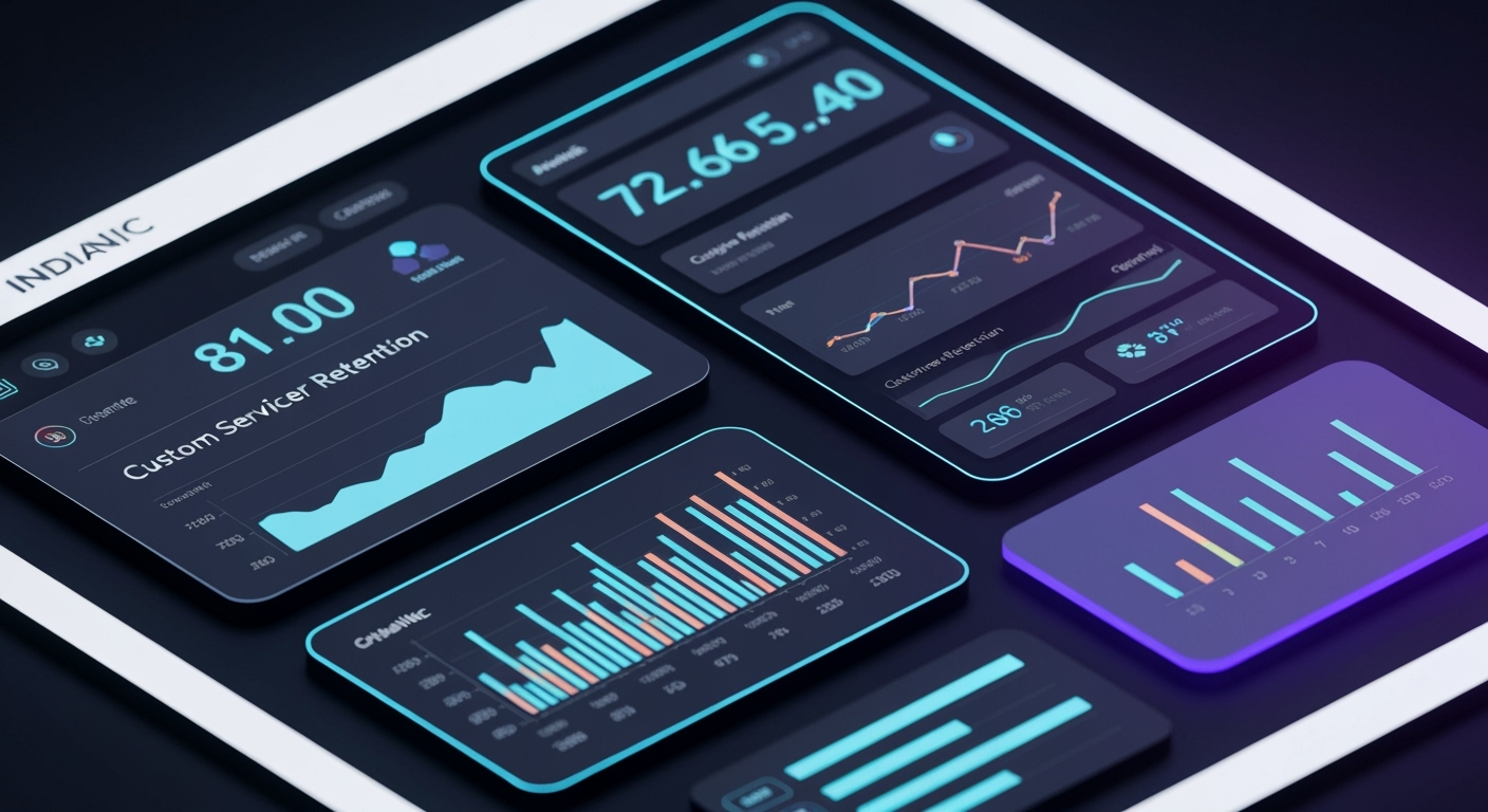
Story time: I remember Michael from Dubai, founder of a promising FinTech SaaS. His initial dashboard was a marvel of data points, graphs, and toggles. He was so proud of its comprehensiveness. But users weren't converting past the free trial. They felt overwhelmed, lost. We helped him strip it back, focusing on just 3-4 key metrics that truly mattered for his target audience. The result? A 30% jump in free-to-paid conversions within two months. It wasn't about *less* information, but *less friction* to get to the important insights.
Minimal UX isn't about dumbing down your product. It's about intelligent prioritization, ruthlessly eliminating distractions, and guiding your user to their 'aha!' moment with the least possible effort. It's about respecting their time and attention.
The Core Principle
At its heart, simplicity is about clarity. It’s about understanding your product's core value proposition and presenting it in the most direct, elegant way possible. Anything that doesn't directly contribute to that value, or enhance the user's ability to achieve it, is a candidate for removal. It takes courage to remove features, but often, it's the smartest move.
Story time: Rohan from Pune, one of our stellar backend developers at IndiaNIC, was once wrestling with a complex reporting module. He came to me, frustrated. 'Sandeep, I can build this, but it's going to be so clunky for the user. What if we just gave them two key views and allowed custom filters instead of 20 pre-set reports?' It was a brilliant suggestion. We went with it, and the client loved the flexibility and ease of use. Sometimes, the best feature is the one you don't build, or rather, the one you simplify.
Here's a funny one: What's a UX designer's favourite programming language? 'Less-CSS'! Because less is always more. (Okay, I'll stick to tech insights!)
This principle of 'less is more' extends beyond just the visual interface. It touches the entire user journey, from onboarding to daily use. Are you making it easy for your users to succeed? What's one thing you could simplify in your product today to make a big impact? Let me know!
Growth Through Clarity
When a SaaS product is simple, it naturally becomes more sticky. Users don't need extensive training, they onboard faster, and they find what they need without frustration. This directly impacts your bottom line.
Story time: Sarah from Sydney, who runs an event management platform, saw her churn rates plummet after we redesigned her booking flow. It went from a multi-page form with optional fields to a single, intuitive step-by-step process. Her users could create an event in minutes, not hours. The word-of-mouth growth was incredible because the product just *worked*.
Story time: Priya from Bangalore, a lead UX designer on our team, always emphasizes iterative design. She'd say, 'Let's build the simplest version, get it in front of users, and only add complexity when there's a proven need.' This approach has saved countless hours and led to products that feel incredibly intuitive from day one. Minimal UX is not about being basic; it's about being efficient.
Think about your own day. Which apps do you use most frequently? I bet they're the ones that get out of your way and let you achieve your goal quickly. That's the power we're talking about.
Beyond Aesthetics
Some people confuse minimal UX with just having a clean, white interface. While aesthetics play a part, true simplicity is deeper. It's about the underlying architecture, the information hierarchy, and the interaction design. It's about making complex workflows feel effortless, even if there's a powerful engine humming beneath the surface.
Story time: Carlos from São Paulo, CEO of an international logistics SaaS, was convinced his detailed analytics needed complex visualisations. We challenged that, proposing a 'digest' view first, with drill-downs only if needed. His team's productivity shot up because they could grasp the big picture immediately, without getting lost in the weeds. It was a game-changer for their daily operations.
Here's a funny one: My CTO once said, 'A good error message is like a good joke: if you have to explain it, it's not good.' Same goes for complex UI, I suppose!
The IndiaNIC Way
At IndiaNIC, this philosophy of 'designing for simplicity' isn't just a buzzword; it's ingrained in our process. We believe that true innovation often lies in refining, not just inventing. It means asking tough questions, challenging assumptions, and always putting the user's journey first. Our teams across Ahmedabad, Udaipur, Hyderabad, and Indore live and breathe this every day.
Story time: Jigar from Ahmedabad, one of our veteran project managers, has a mantra: 'When in doubt, delete it out.' He encourages our teams to start with the absolute bare minimum for an MVP and then, with user feedback, carefully consider any additions. It prevents feature creep and ensures every element serves a purpose.
Story time: Ahmed from Dubai, a client who runs a thriving e-learning platform, recently told me how much he appreciated our streamlined development process. He said, 'Sandeep, your team didn't just build what I asked for; they built what my users *needed*. It's so clean, so intuitive.' That feedback, for me, is golden. It means we're doing something right.
How do you balance adding new features with maintaining simplicity in your own product development? I'd love to hear your approach!
Implementing Simplicity
So, how do you achieve this 'minimal UX' magic? It's not a one-off task; it's a continuous mindset. You start with deep user research to truly understand their pain points and goals. Then, you prioritize ruthlessly. What's the one thing they absolutely *must* achieve? Build that brilliantly.
Story time: Amit from Hyderabad, one of our dedicated QA leads, once found a 'hidden feature' that was accessible by three clicks and served no real purpose. He championed its removal, arguing that even if 0.1% of users found it, 100% of the codebase was carrying its weight. It's about being efficient not just for the user, but for your developers too!
Story time: Jennifer from Seattle, founder of a B2B marketing automation tool, focused on a lean MVP with us. Her initial launch was incredibly simple – just email automation. But because it was so easy to use, her early adopters became huge advocates, driving organic growth before she even considered adding more complex features.
Story time: Neha from Udaipur, a brilliant product owner, once made a client choose. 'You can have these five new features, or you can have the current product be 100% stable and incredibly fast. Which one truly drives user value *right now*?' It's about making those tough calls that prioritize the user's core experience.
Iterate constantly, test with real users, and be prepared to remove features just as readily as you add them. Simplicity is a journey, not a destination. What's the biggest challenge you face when trying to simplify your product's UX?
Your Growth Engine
Ultimately, designing for simplicity isn't just about aesthetics or even ease of use. It's a powerful growth strategy because it builds trust, reduces friction, and allows users to quickly realize the value your SaaS product offers. In a competitive landscape, the product that is easiest to understand, easiest to use, and quickest to deliver results will always win.
So, next time you're thinking about adding that new, shiny feature, pause. Ask yourself: 'Does this simplify, or complicate?' The answer might just be the key to unlocking your next big growth phase.


